

Project Vision
Muse strives to create an inclusive environment to ensure everyone can enjoy their museum experience and get the most out of their visit by creating a visually engaging interface that’s simple to use, works at any art museum in the world, is universally understood, and ensures a smooth navigational experience within the museum from start to finish.
Challenges
1) Prevent users from getting lost within the museum they’re in utilizing in-app navigation
2) Offer an easily navigable and universal experience for users no matter their native language
3) Create an accessibility friendly app that allows everyone to enjoy art on their personal devices
Meet the Users

Helena
PRIMARY PERSONA
Age: 33
Occupation: Family and Divorce Attorney
Helena is a family lawyer who lives in a large city but rarely has the time to spend on her hobbies due to her demanding job and personal life. She really enjoys the city’s art museum but due to her visual impairment, struggles to enjoy it fully as they don’t offer any kind of accessibility features. Her family assists her when they go together, but Helena would like to be able to go alone and not need to rely on others to enjoy the museum.

Reuben
SECONDARY PERSONA
Age: 21
Occupation: Intern Computer Programmer; Student
Reuben is an intern computer programmer at an international company in the city where he attends college. He immigrated to America from Poland when he was 15 and is only partially conversant in English. One of Reuben’s favorite activities is going to the museum with his older brothers, but he struggles greatly with reading the plaques beneath artwork and tends to get lost in museums due to their size and being unable to read signage.
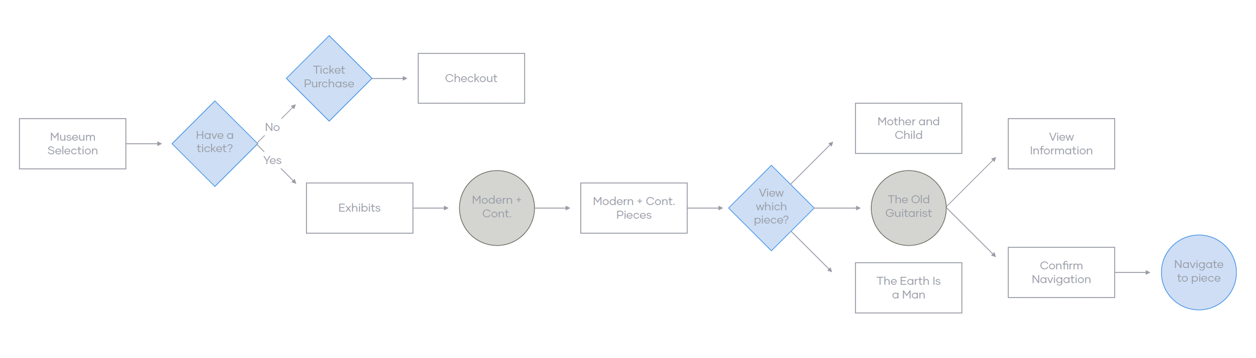
Helena’s Journey
I constructed a basic version of what Helena’s journey might look like through Muse. This helped me understand ways in which users might interact with the product and allowed me to see potential navigational methods through the app.
Competitive Analysis
I looked at a handful of potential competing companies and while none of them directly competed with the offerings of Muse, the potential for infringement is there in the user preference. Muse has the unique opportunity to capitalize on all of the features of these apps and bring them to one convenient location that works for any art museum in the world.
Two of the primary feature differences I noticed were:
- Seamless integration with existing museums
- Scope of information included
Initial Sketching
The same method of brainstorming was used for each screen across the product. 6 thumbnails were quickly sketched in a set time of 5 minutes for each screen and after all thumbnails were created, I went back through and chose the elements of each that I wanted to include in the final wireframe design.

Wireframing
After some initial pen and paper sketching, I reviewed each sketch to decide what was necessary to include throughout the product. I looked from two perspectives: at the app as a whole and at a more detailed, per-page view. I spent the bulk of my time on this project in the wireframing stage as I wanted to ensure it flowed well and worked for my users before moving onto visuals.

Ideation
Once the wireframes were finalized, I began preparing questions and tasks for my usability studies. I asked 5 different people to run through my prototypes in hopes of garnering enough feedback to use in future design iterations.
The findings for each study are below:
Round 1
a. Larger text and a smaller nav
b. Users wanted to be able to view pieces in order in a queue
c. More appropriately sized buttons
Round 2
a. A more obvious way to know they had added something to their cart
b. Text labels for all buttons


Challenge 1
PREVENT USERS FROM GETTING LOST IN THEIR MUSEUM
The built in map feature allows for users to find their desired piece and navigate to it directly from the info screen. Users would also be able to use this feature to create a queue to view their pieces in a specific order which prevents backtracking and allows for a more efficient museum experience.

Challenge 2
OFFER AN EASILY NAVIGABLE AND UNIVERSAL EXPERIENCE FOR USERS NO MATTER THEIR NATIVE LANGUAGE
Muse includes a pre-login language changing feature right on the splash page to encourage users of any native language to try it out.

Challenge 3
CREATE AN ACCESSIBILITY FRIENDLY APP THAT ALLOWS EVERYONE TO ENJOY ART ON THEIR PERSONAL DEVICES
Muse is heavily imagery-based which means alt-text is needed throughout. In addition, another accessible feature was added to allow users to open a full-screen version of any art piece they’re looking at and be able to zoom in closely to view details like brush strokes or different textures.

Style Guide
The colors chosen for Muse perfectly express everything that Muse is about; simplicity, cohesion, and timelessly classic. The fonts also encompass the modern, yet vintage feeling Muse emits throughout it’s screens. The splash screen welcome also perfectly encapsulates the sophistication, beauty, and simplicity the product offers.


Takeaways
As an art enthusiast, and a heavy museum-goer, Muse is an idea that is near and dear to my heart. This was my first time doing a full design process that included heavy research in it and it was an interesting sidestep from what I’m used to doing in my design world. The idea of focusing heavily on the persona as a real user was incredibly helpful in ensuring my app was user-centered first, and business-centered second.
It was also very interesting to challenge myself to focus heavily on accessibility. I had practiced working with accessibility in my previous design assignments from school and from various jobs that were primarily print based in nature, but never have I done something to this extent involving accessibility. I can see this experience being very useful for my projects moving forward!
Be sure to check out the process for Muse’s creation below!