
Photo by Nelya | nelya.net
My younger sister Hannah was the first of my three sisters and I to get married and I was so honored that she asked me to do her wedding stationery for her. Having known her her entire life, I had a pretty easy time coming up with something she deemed worthy of sending out to her guests. Hannah has always loved greenery and timelessly classic, yet modern design. This set of stationery perfectly encapsulates my sister’s style and idea for her dream wedding.
IDEATION
The process of ideation didn’t actually start with the wedding stationery and instead began with Hannah’s Bridal Shower Luncheon invitations as well as her Bachelorette Weekend invitations. This is where the fonts and initial color palette were chosen as well as the start to exploring having touches of greenery across her stationery. The first iteration of foliage was something more cartoon-y than her invitations ended up being.


Ideation for the wedding stationery began with the invitation. As the central point of the stationery, it would ultimately decide how everything else would look. Many variations were explored, including left aligned and centered orientations, various wildflower designs and positions, and a variety of different shades of green.


The couple decided they liked the centered option the best, wanted their initials included and some but minimal greenery imagery. They also described wanting their invitations to feel modern and that they felt the very traditional border was taking away from that. So I went back to work and this is what I came up with.
DELIVERABLES

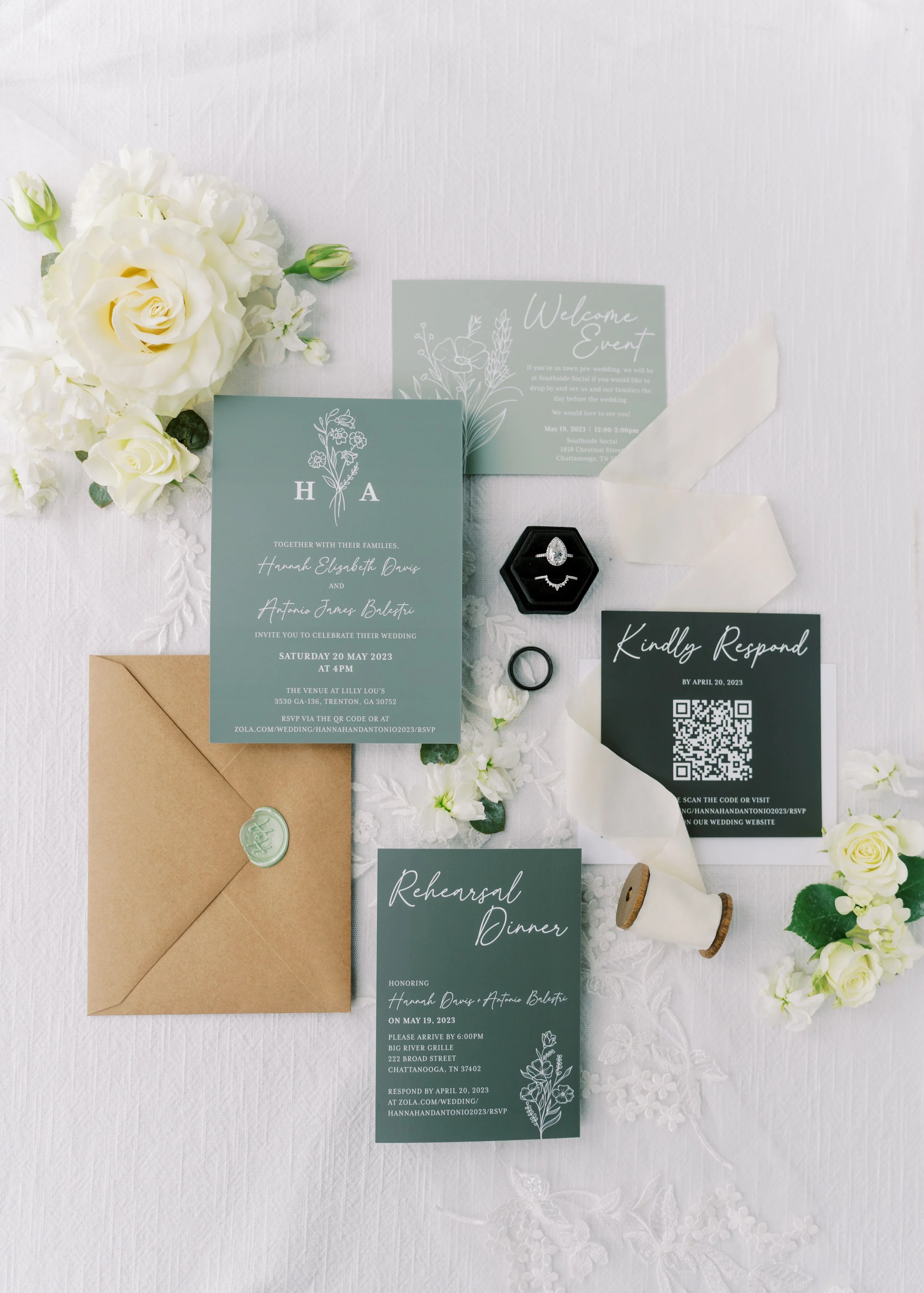
Photo by Nelya | nelya.net
Simple, elegant, and timelessly classic. Hannah’s photographer Nelya perfectly flat laid and captured the aesthetic she was going for. Once the invitation was designed, the remainder of her stationery came together quickly.


To ensure guests would pay attention to each piece as a separate entity, I decided to make each piece a different shape and size. The invitation and the rehearsal dinner were the same size as they were closely related in content and only certain guests received invitations to the rehearsal dinner.
Overall, this was an incredibly fun and rewarding process. Layout is always my favorite part of the design process, specifically figuring out the puzzle of laying out varying lengths of text so that it appears balanced yet tasteful. My sister was so pleased with how these turned out and we had a blast working through making these perfect for her special day.
EXTRAS
In addition to her invitations and general wedding stationery, I was also allowed to spearhead the design for her place cards and seating chart. These were also fairly simple as they utilized the same greenery, colors, and fonts used throughout the rest of her design.

