


Each sour ale in existence is unique and that uniqueness deserves equally unique and eye-catching packaging. Hoodwink Sour Ale from Spillville, Iowa encapsulates everything that is a sour ale, and adds its own twist.
Ideation


Ideation began with mood boarding. I looked at artsy beer cans and bottles, as well as interesting type moments for inspiration.


The next step was quick mockups. I stuck with two main color palettes and very early ideas and typefaces, focusing on the main label and leaving the neck until later.

This was the close-to-final idea for this packaging, including the back label and the neck.
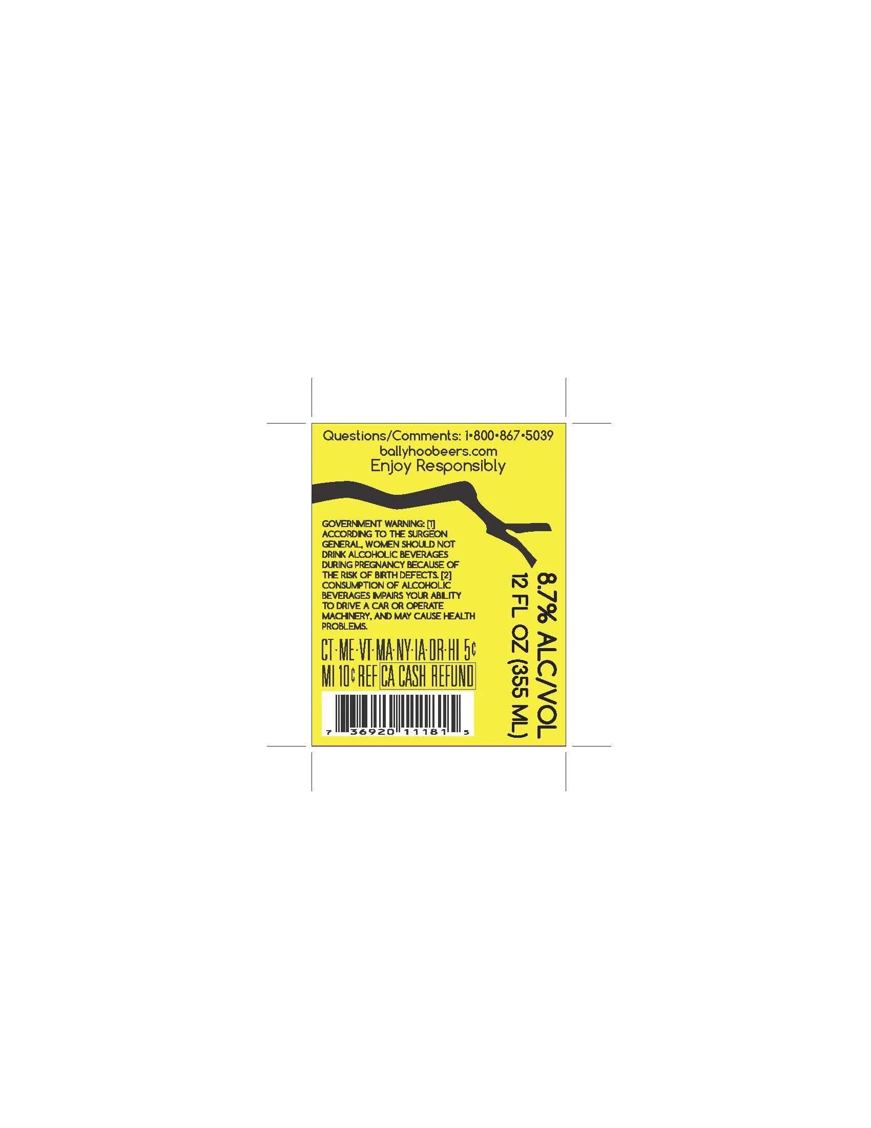
Deliverables
The final product kept elements of the close-to-final draft such as the wrapping branch, the owl, the moon Limited Release, and the typography. The color was changed to a dark nightly purple color, and the owl was drawn more realistically. Printed, the purple color appears a lot darker and the eyes pop, staring at you off the shelf.

