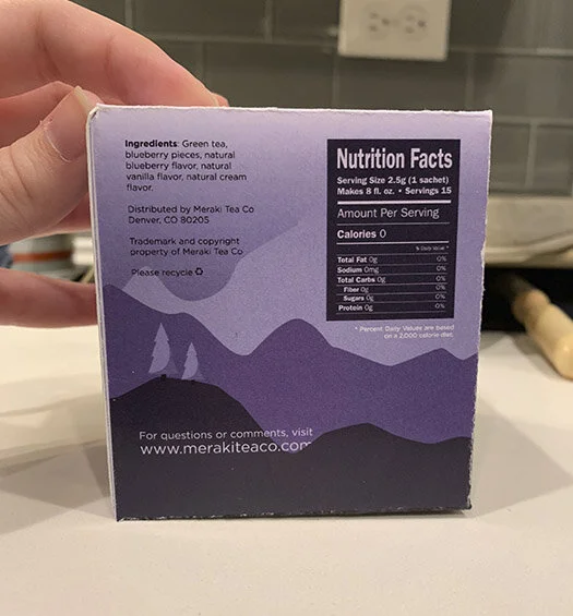
Meraki Tea Co. is an imaginary tea brand focused on adventure. The word Meraki is a term that Greeks use to describe doing something with soul, creativity, or love. A brand that’s focused on adventuring with soul, deserves some packaging to match.
Ideation
Ideation began with conceptualizing brand name and identity. I stumbled upon the term “meraki” during a Pinterest deep dive and loved it. We began our brainstorming for designs by coming up with an initial concept for the look and feel we wanted for the branding. Wanting this to be adventure and travel-related I focused on various depictions of that idea.


After the initial brainstorming session, we were given a competency exercise in which we had to quickly design three options for a single panel using the same information each time.


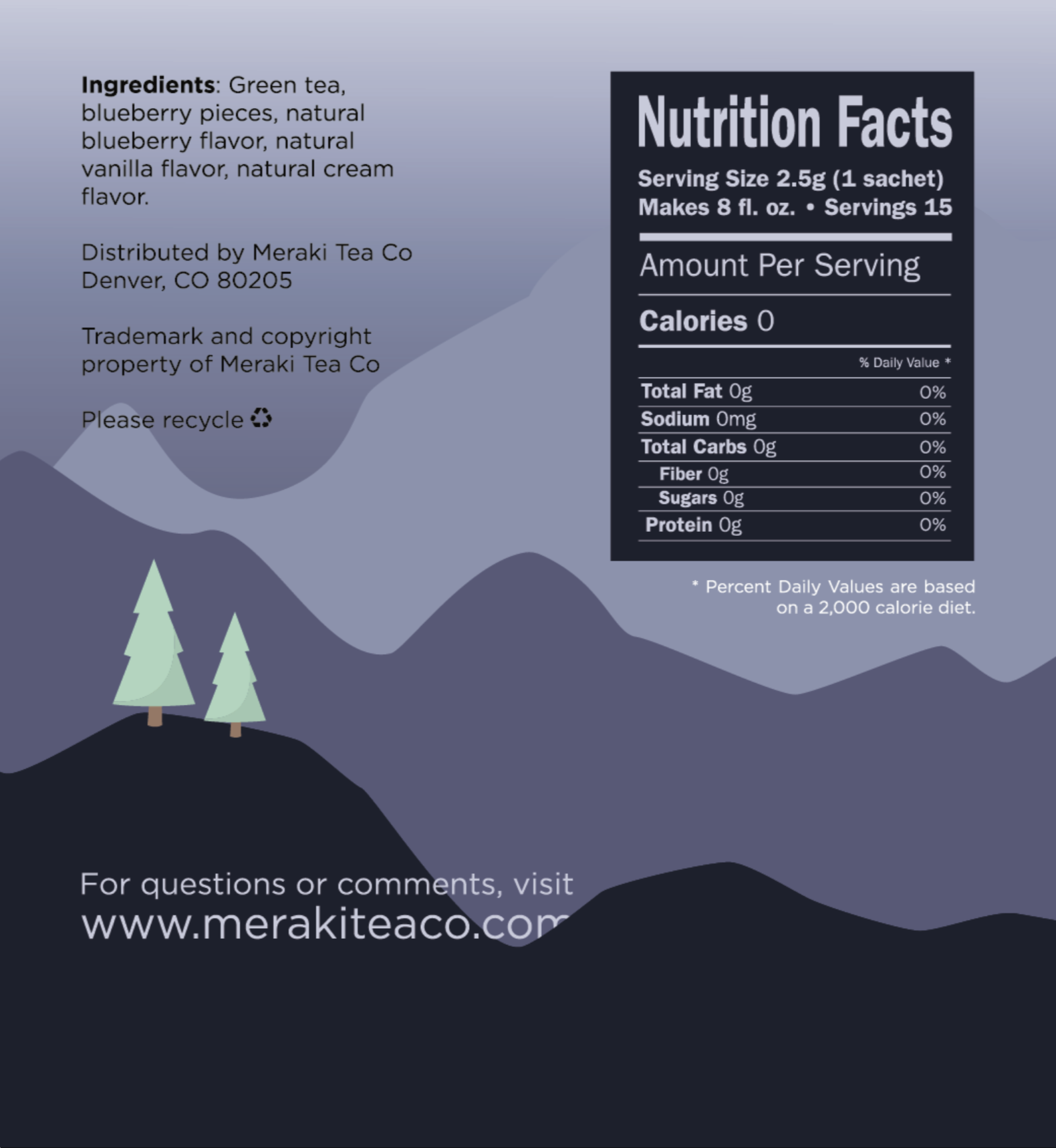
I chose a purple color palette and used mainly typography with the occasional iconography. I decided my favorite version was the one with icons, however I condensed to icons for just the “hot tea” and “iced tea” options. For the final, I also decided to add in splashes of green to break up the primarily purple palette.


Deliverables
For critique, I had to print my box dieline and physically build it. The physical box had my third draft design which kept the entire box purple including the trees, the house, and the leaves in the hot and iced tea. My final design included the splashes of green.